A grid that remembers every screen
 NINikki Sophie 🌸4 min read1 view
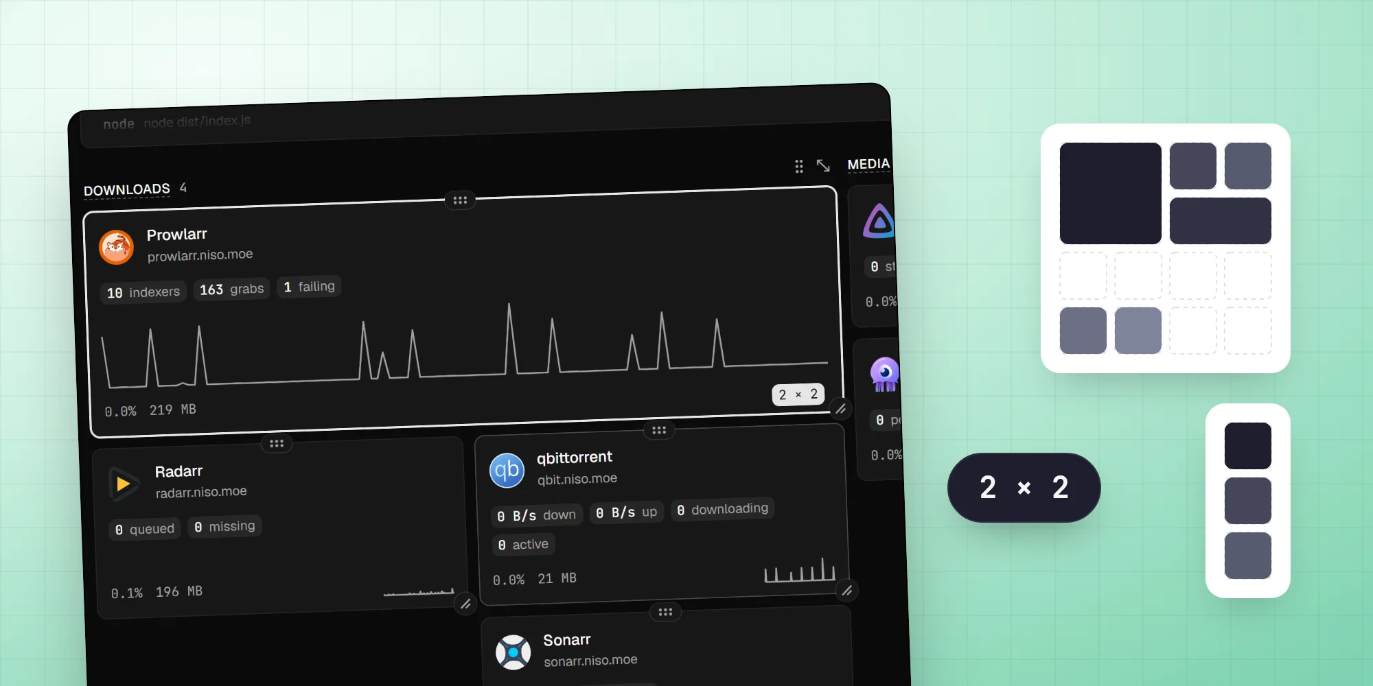
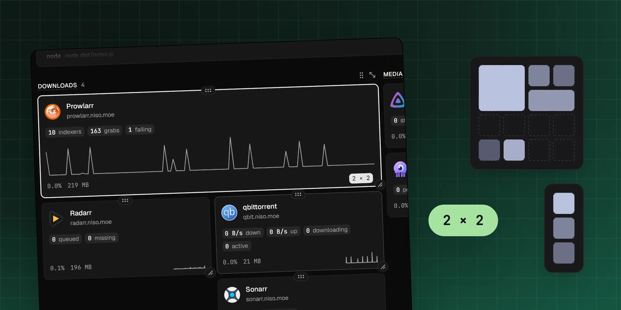
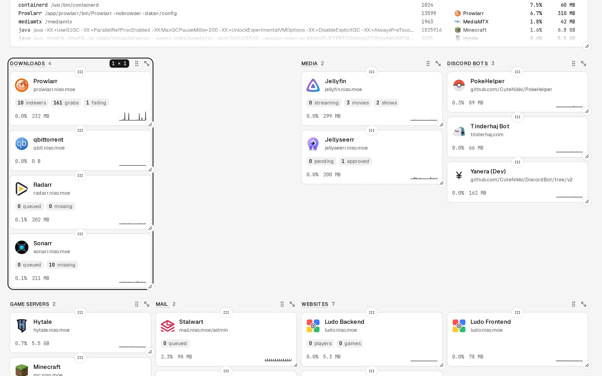
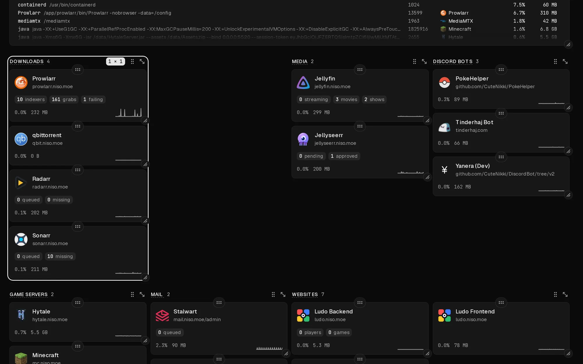
My server dashboard shows every service as a tile, and I wanted to arrange them myself: Jellyfin big, the game servers next to each other, the boring infrastructure at the bottom. Tile grids that you can drag around are a solved problem. What I didn't expect was how many decisions it takes before "arrange the tiles" means one clear thing, especially on screens of different widths.
A column for every 300 pixels
The page is a grid of columns, one for roughly every 300 pixels of screen width: one on a phone, four on a 1440-pixel laptop, eight from 2496 pixels up.
Each tile has a place on that grid: a column, a row, and how many of each it spans, up to six rows tall. The browser saves its column count in a cookie, so the server can render the right layout on the next visit instead of flashing the wrong one first.
Gaps are allowed
The first version had no places at all. Tiles kept an order and flowed into the columns one after another, the way most dashboard grids pack them. That's simple, but it can't leave a hole: move a tile away and everything after it slides up. I wanted space between things on purpose, to set the game servers apart from the media.
So now every tile has a place of its own, and nothing moves up on its own. A tile lands where it's dropped. Whatever it lands on gets pushed down, and whatever that lands on gets pushed down too, but the space a tile leaves stays empty. The only exception is a row with nothing in it at all, which gets removed, since an empty row is never what anyone meant.
Each width keeps its own
The hard question was what happens when the screen changes. If I arrange four columns on my laptop and then open the dashboard on an eight-column monitor, what should it show?
Every column count has its own saved layout. Arranging on the laptop only changes the four-column layout, and the phone's single column stays as I left it.
I did try the other way once. In that version, arranging on one screen arranged every screen: tiles and sections kept one order and one size each, and every width laid them out row by row from that order. It meant arranging once instead of once per screen, which sounded like less work for me as the user. I reverted it the same day. Laying tiles out row by row from an order is the old packing again, and the gaps I'd just made possible were gone. Arranging each width on its own is more work, but it's the only way a layout can mean exactly what I made it.
Starting from the nearest
That leaves widths I've never arranged. For those, Dashboard finds the nearest column count that has been arranged, preferring the wider one if two are equally close, and packs its tiles into the columns available: the same tiles, in the same reading order, at the same sizes, clamped to fit.
Reading order is what carries over between widths. Exact positions don't mean much in a different number of columns, but "Jellyfin first, then Sonarr" does. A new service that's never been placed goes at the bottom.
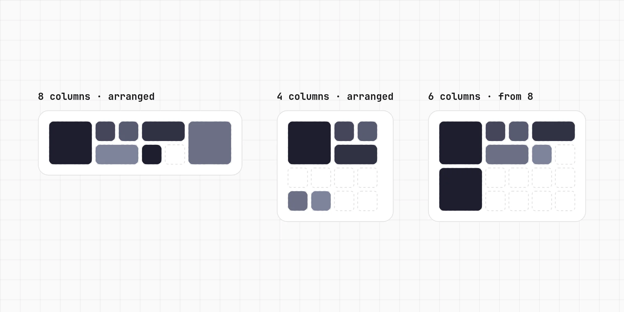
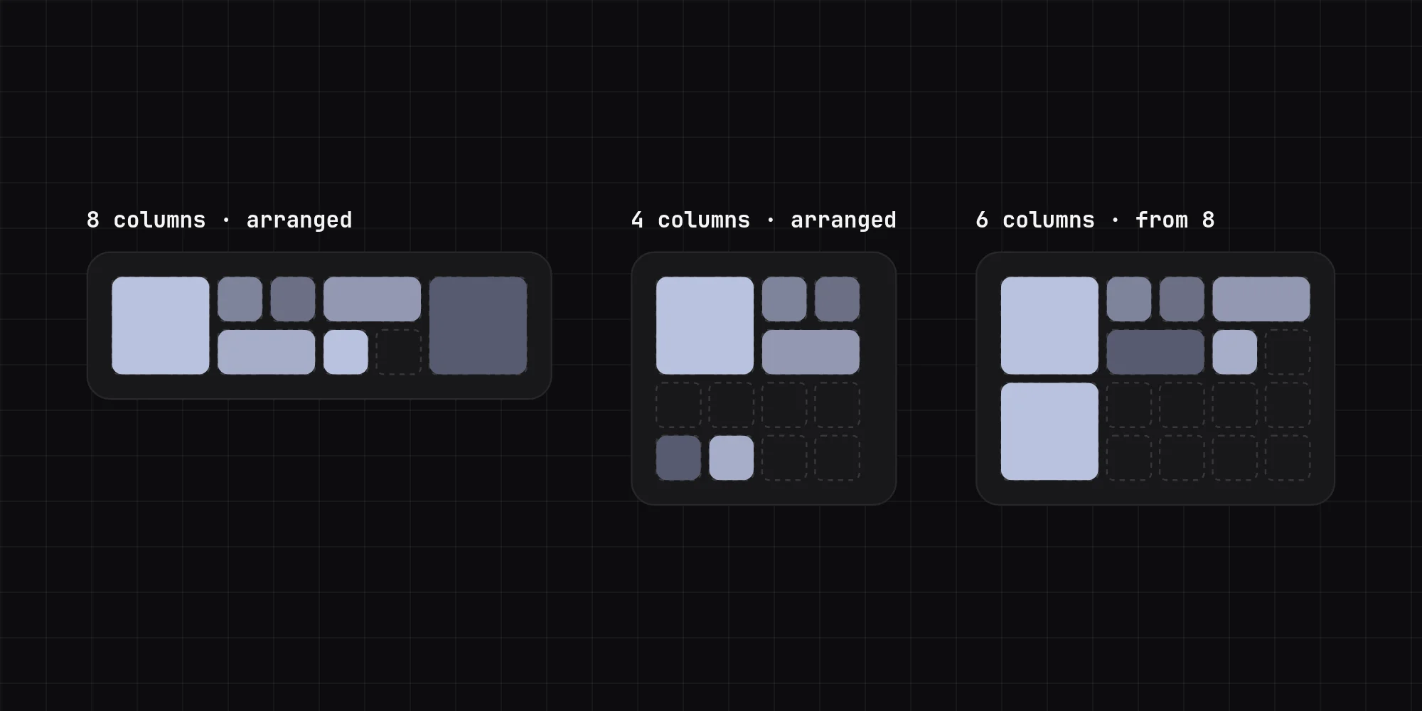
That derived layout isn't saved. It's worked out every time, until I arrange that width myself.
Sections are tiles too
Tiles are grouped into sections, like Media or Games, and the sections sit on the page's grid the same way tiles sit in a section. A section can be narrowed to one column so two sit side by side, and its tiles lay themselves out again in the columns it has left. It's the same problem one level up, so the same placing and pushing code runs for both.
Editing as a mode
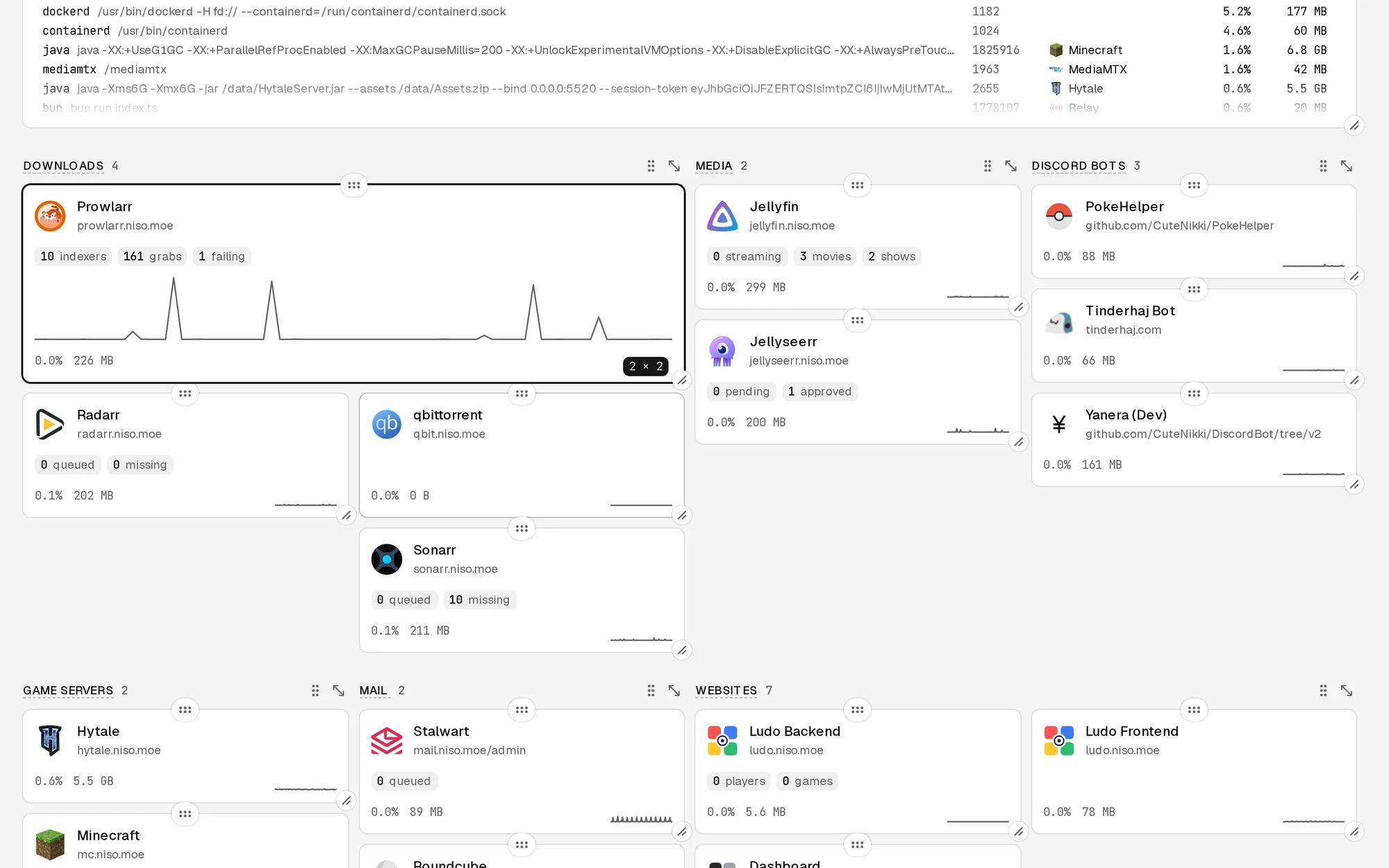
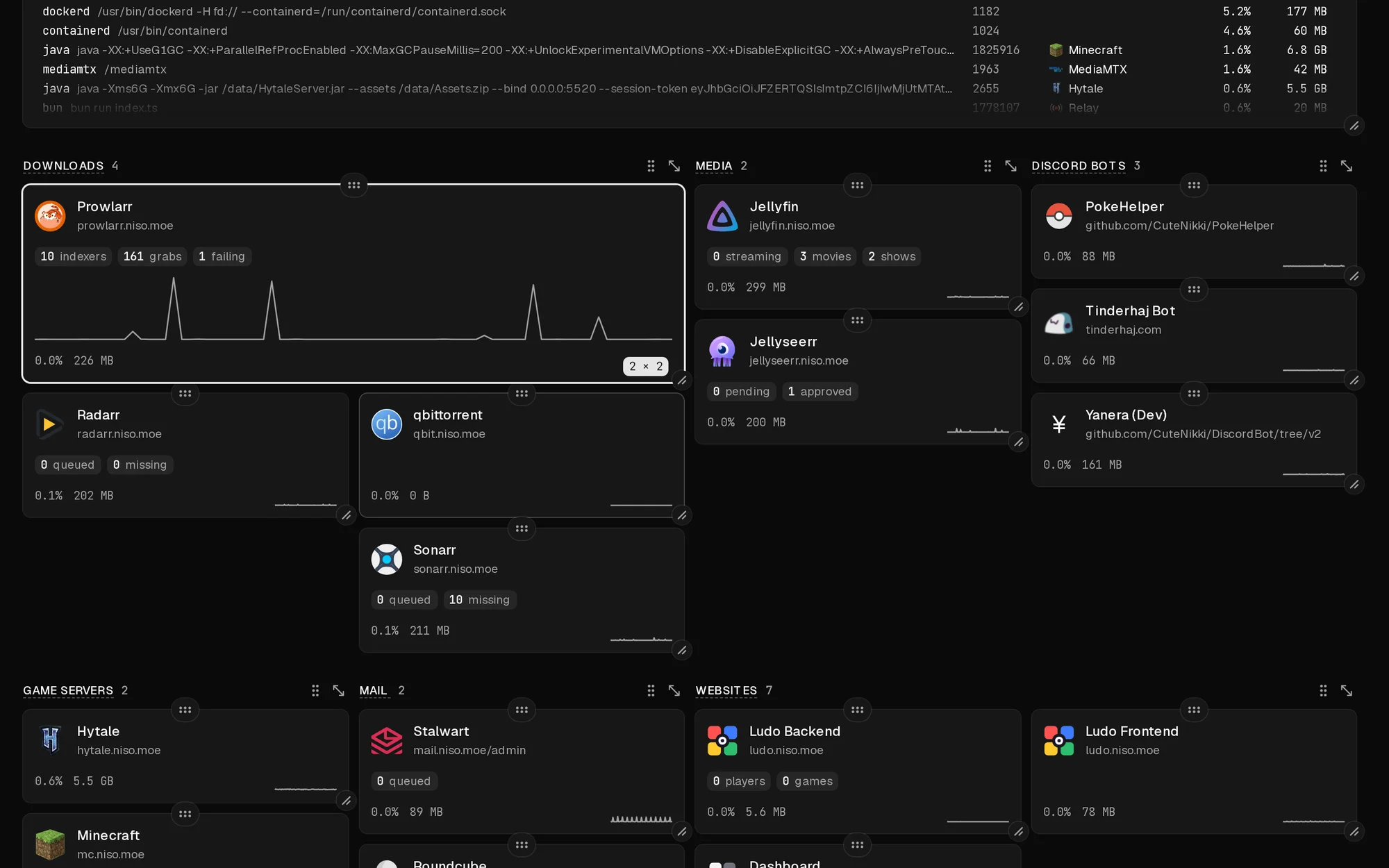
Arranging happens in an edit mode, turned on from the header. Each tile gets a tab on its top edge to drag it by and a knob on its corner to resize it, snapping to whole columns and rows, with a badge showing its size, like 2 × 2, while it's being dragged.
At first every change saved straight away. That's fine until you drag something to the wrong place and there's no way back. Now changes are held until I click Done, and Cancel puts everything back. Leaving the page with unsaved changes asks first.
The rest is about not leaving anyone out:
- Keyboard: from a tile's tab, the arrow keys move it one cell, and with Shift they resize it.
- Phones: holding a tile for a moment picks it up, so a normal swipe still scrolls the page. The tab and knob pick it up straight away.
- Bigger tiles show more: a tile more than a row tall draws its CPU as a full graph, and a wider one stretches its sparkline. Resizing changes what a tile shows, not only its size.
What it comes down to
Dragging boxes around is the easy part, and a library handles it well. The work was deciding what a layout is: a place per tile per width, gaps that stay, and reading order as the one thing that carries over when there's no saved layout. Once that was settled, most of the code wrote itself.
No comments yet. Be the first!